One of the primary purposes of ProPlotFits is to explain, in both Spanish and English, how to look at pitch data from Baseball Savant.
Sure we could simply look at Salvy’s profile page on there, but there is a lot going on. So my goal is to simplify it for everyone.
Salvy, just like every other non-pitcher on the Royals staff, is paid for his ability to see pitches. As data analysts, we can use this data to take a peak inside to see how the Royals’ analytics departments are consulting the batting coaches.
The data
It is called Baseball Savant because it tracks every pitch thrown in the MLB, the velocity of the baseball as it exited contact with the bat, the angle it was launched at, and the trajectory of the ball as it leaves the bat, among other data.
To pull every pitch seen by Salvador Pérez in 2025, 1,618 in total, we run the following piece of code in R:
Code
library(tidyverse)
Warning: package 'tidyverse' was built under R version 4.5.2
Warning: package 'ggplot2' was built under R version 4.5.3
Warning: package 'tibble' was built under R version 4.5.2
Warning: package 'tidyr' was built under R version 4.5.3
Warning: package 'readr' was built under R version 4.5.3
Warning: package 'dplyr' was built under R version 4.5.2
Warning: package 'stringr' was built under R version 4.5.3
Warning: package 'lubridate' was built under R version 4.5.3
── Attaching core tidyverse packages ──────────────────────── tidyverse 2.0.0 ──
✔ dplyr     1.2.0     ✔ readr     2.2.0
✔ forcats   1.0.1     ✔ stringr   1.6.0
✔ ggplot2   4.0.2     ✔ tibble    3.3.1
✔ lubridate 1.9.5     ✔ tidyr     1.3.2
✔ purrr     1.1.0
── Conflicts ────────────────────────────────────────── tidyverse_conflicts() ──
✖ dplyr::filter() masks stats::filter()
✖ dplyr::lag()    masks stats::lag()
ℹ Use the conflicted package (<http://conflicted.r-lib.org/>) to force all conflicts to become errors
Rows: 1618 Columns: 118
── Column specification ────────────────────────────────────────────────────────
Delimiter: ","
chr  (16): pitch_type, player_name, events, description, des, game_type, sta...
dbl  (93): release_speed, release_pos_x, release_pos_z, batter, pitcher, zon...
lgl   (8): spin_dir, spin_rate_deprecated, break_angle_deprecated, break_len...
date  (1): game_date

ℹ Use `spec()` to retrieve the full column specification for this data.
ℹ Specify the column types or set `show_col_types = FALSE` to quiet this message.
Take a look at Salvy’s ID 664728 within the URL. Replace that value with the ID of another player and you’ll get their stats.
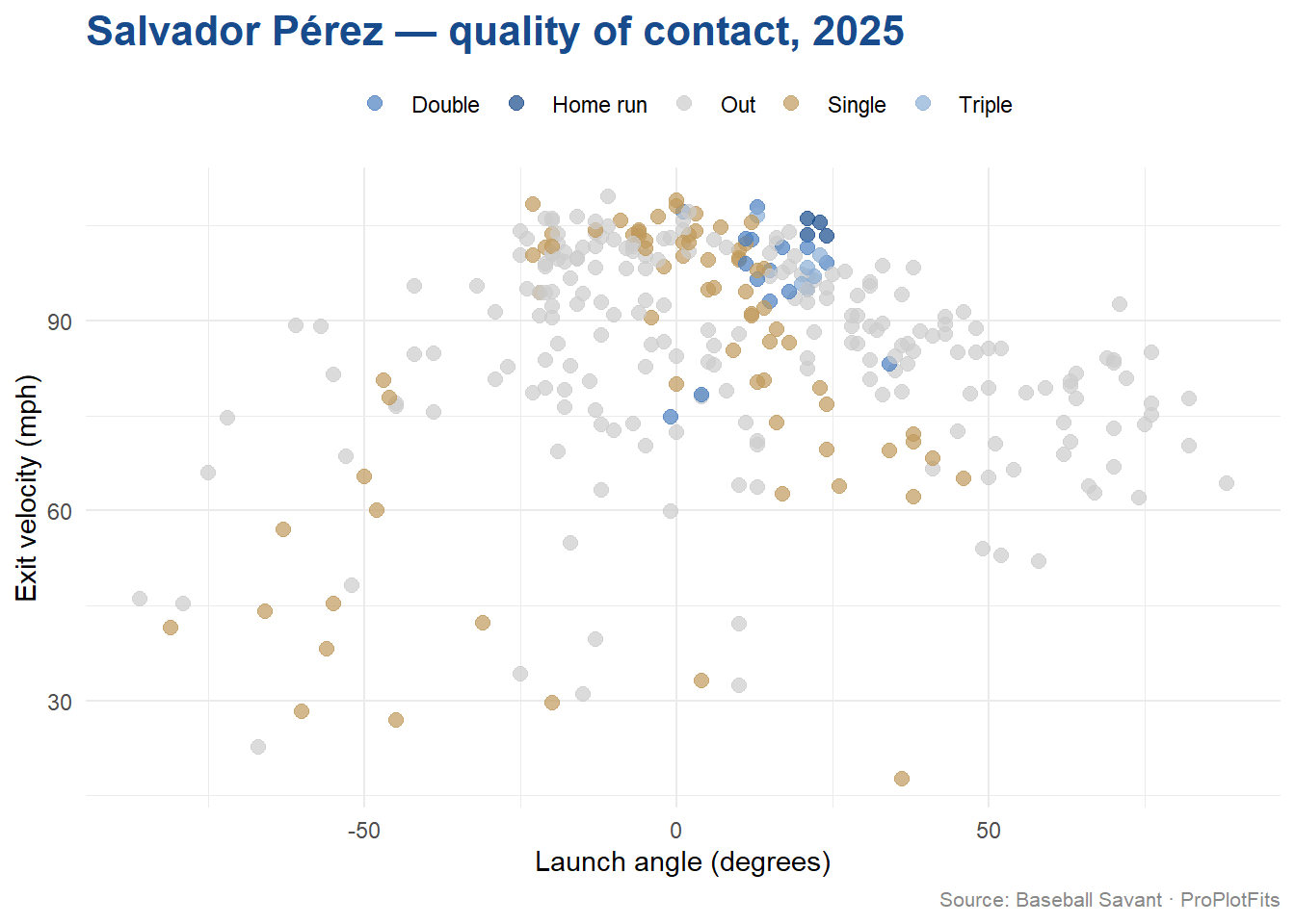
Exit Velocity and Launch Angle
It’s been 10 years since the Royals won the 2015 World Series. That October happened to be during my senior year of high school. Since then I’ve gone on to graduate with a Masters’ degree in Business Analytics and have logged work experience for a regional transportation agency, a transportation-focused civil engineering firm, and the leading debit routing FinTech firm in the United States.
I am just now getting around to learning about how important Exit Velo and Launch Angle have become to baseball, a sport historically know for statistics. It looks like everyone wants to know two things: how hard did you hit the ball, and how much did you “launch” it?
Exit Velo is simply a measure of how hard the ball left the bat, and it is measured in miles per hour. However, the launch angle tells us the story of whether the batter hits a fly ball (>0 degrees), a line drive perfectly parallel to the ground (0 degrees), or a ground ball (<0 degrees).
The below code filters for every pitch that Salvy batted into play and plots their result onto a scatter plot. Read the comments in the code to see what exactly is happening line-by-line:
Code
# start with the data frame, where every row is a pitchsalvy_2025 %>%# if either launch speed or launch angle are NA, then it wasn't batted, so we don't want those pitchesfilter(!is.na(launch_speed), !is.na(launch_angle)) %>%# the case when helps us create a helper variable `outcome` that helpfully condenses the `events` column mutate(outcome =case_when( events =="home_run"~"Home run", events =="single"~"Single", events =="double"~"Double", events =="triple"~"Triple", events %in%c("field_out", "force_out", "grounded_into_double_play","double_play", "fielders_choice_out") ~"Out",TRUE~NA_character_ )) %>%# we only want hits or outs, so filter out any NA's in `outcome`filter(!is.na(outcome)) %>%# now we are plotting the scatter plot here, putting launch angle on the x-axis and launch speed on the y-axis, coloring each point but the outcomeggplot(aes(x = launch_angle, y = launch_speed, color = outcome)) +# setting transparancy (alpha) and size of the pointsgeom_point(alpha =0.7, size =2.5) +# manually declaring the color of each outcomescale_color_manual(values =c("Home run"="#174B8B","Double"="#4A7FC1","Triple"="#8AADD4","Single"="#C09A5B","Out"="#CCCCCC" )) +# filling in the labelslabs(title ="Salvador Pérez — quality of contact, 2025",x ="Launch angle (degrees)",y ="Exit velocity (mph)",color =NULL,caption ="Source: Baseball Savant · ProPlotFits" ) +# setting overall theme elements of the plottheme_minimal(base_family ="sans") +theme(plot.title =element_text(size =16, face ="bold", color ="#174B8B"),plot.caption =element_text(size =8, color ="#888888"),legend.position ="top" )
This first version of the plot tells us something clear: that between 10 and 30 degrees, at 95 mph and above, Salvy is crushing it. That is his “wheelhouse”, so to speak.
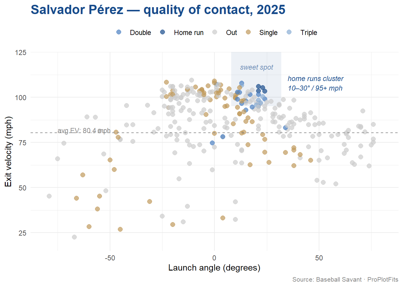
Highlighting Salvy’s Wheelhouse
As data analysts, our goal when communicating to stakeholders (the hitting staff and Salvy) is to make conclusions obvious.
Let’s add three things to the plot to generate a publication-quality output that could very well be something that the Royals are already showing Salvy. Let’s add a shaded rectangle marking the wheelhouse, a line referencing the average exit velo, and a label that points to where his home runs are.
To find Salvy’s average exit velo, run the following code:
Code
avg_ev <-# start with original data frame salvy_2025 %>%# make sure launch speed doesn't have any NA'sfilter(!is.na(launch_speed)) %>%# calculate the mean of lanch speed (exit velo, or ev)summarise(mean_ev =mean(launch_speed)) %>%# pull the number out as a variable rather than keeping the object a data framepull(mean_ev)
From R, we can see that Salvy’s average exit velo for all batted balls in 2025 is 80.4 mph. This number is going to sit well below the wheelhouse since it includes every dribbling ground out and line drive hit straight to a fielder.
Warning: Removed 6 rows containing missing values or values outside the scale range
(`geom_point()`).
Thoughts from the Plot
There are three points to make from this plot.
First, Salvy’s home runs are exactly inside his sweet spot or wheelhouse, which means this outcome is repeatable. Salvy genuinely has skill, and this plot is evidence that when he elevates and makes hard contact, the likely outcome is that the ball goes over the fence.
Second, Salvy had a lot of hard-hit outs, as can be seen by the many gray points sitting above his average Exit Velo. You can also tell that by his natural launch angle profile, even though he is hitting the ball extremely hard, a lot of that power is being sent into the dirt. This plot confirms what we already know about Salvy, that he isn’t a fly ball hitter by nature.
Finally, the singles below his average Exit Velo show that Salvy can stay productive even when the power isn’t there. There is a wide variance of launch angle among the soft-hit singles. These are plays that don’t make the highlight reel but are nonetheless still contribute to Salvy’s overall production. I am making an educated guess from this plot that he had at least six bloop singles, as evidenced by the cluster of gold points sitting above 30 degrees launch angle and below his 80.4 mph average exit velo.
Heading into 2026
Salvy turns 36 in May.
The question is not whether he can still hit. The plotting of 2025 data demonstrate that he is an above-average Major League hitter.
The question is can Royals manage his workload well enough to keep those dots in the sweet spot deep into September. Are the Royals confident in the back-up catchers to step-in and perform defensively at the same level when Salvy needs a day at DH?
We will be tracking it all year.
Nos vemos en el diamante.
— ProPlotFits, Kansas City
Data: Baseball Savant, 2025 season. Analysis: R / tidyverse / ggplot2. Code available on GitHub.